CSS Tutorial
CSS (Cascading Style Sheets) is a fundamental technology used to style and format the presentation of web pages. It allows you to control the layout, fonts, colors, and other visual aspects of HTML elements. In this comprehensive CSS tutorial, we'll cover everything you need to know to get started with CSS and become proficient in styling web pages.
Table of Contents:
1. Introduction to CSS
- What is CSS?
- CSS syntax and how it works with HTML
- Ways to include CSS in your web pages (inline, internal, external)
2. CSS Selectors
- Understanding selectors and how they target HTML elements
- Element selectors, class selectors, ID selectors, and attribute selectors
3.CSS Properties and Values
- A comprehensive list of common CSS properties (e.g., font, color, margin, padding, border, background, etc.)
- Units of measurement in CSS (e.g., px, em, rem, %)
- Cascading and specificity rules
4. CSS Box Model
- Understanding the concept of the box model (content, padding, border, margin)
- How to control element dimensions and spacing using the box model
5. CSS Layout
- Introduction to CSS layout techniques (float, position, display)
- Creating responsive layouts with Flexbox and Grid
6. CSS Typography
- Controlling font styles, sizes, weights, and families
- Working with web-safe fonts and Google Fonts
7. CSS Transitions and Animations
- Adding smooth transitions to elements (e.g., hover effects)
- Creating simple animations using CSS keyframes
8. CSS Media Queries
- Making web pages responsive using media queries
- Adapting styles for different screen sizes and devices
9. CSS Best Practices and Tips
- Writing clean and maintainable CSS code
- Organizing CSS with the use of classes and IDs
- Performance optimization techniques
10. CSS Preprocessors (Optional)
- Introduction to CSS preprocessors like Sass and Less
- How to use variables, mixins, and nesting for more efficient CSS authoring
11. CSS Frameworks (Optional)
- Overview of popular CSS frameworks like Bootstrap and Foundation
- How to use pre-built CSS components to speed up development
12. CSS in Real-World Projects
- Practical examples and case studies of CSS usage in web development
- How to troubleshoot and debug CSS issues
Introduction to CSS:
CSS, short for Cascading Style Sheets, is a stylesheet language used to describe the presentation and formatting of HTML documents. It provides a way to control the appearance of web pages, including the layout, colors, fonts, and other visual aspects. With CSS, you can separate the content of your web page from its presentation, making it easier to maintain and update the design.
What is CSS?
CSS acts as a styling layer on top of the HTML content, allowing you to define how the elements should be displayed on the screen or other media types. By modifying the CSS rules, you can change the entire look and feel of a website without altering the underlying HTML structure.
CSS Syntax and How it Works with HTML:
CSS syntax consists of rulesets, each containing one or more selectors and corresponding declarations. A selector targets HTML elements, while declarations specify the style properties and their values for the selected elements.
cssselector {
property: value;
/* Additional properties and values */
}
For example, to change the color of all the paragraphs (p elements) in an HTML document to blue, you can use the following CSS rule:
cssp {
color: blue;
}
Ways to Include CSS in Your Web Pages:
There are three primary ways to include CSS in your web pages:
- Inline CSS: You can apply CSS directly to an HTML element using the
styleattribute. This method is suitable for applying quick and specific styles to individual elements.
Example:
html<p style="color: red;">This paragraph has red text color.</p>
- Internal CSS: Internal CSS is placed within the
<style>element in the<head>section of the HTML document. The styles defined here will apply to the entire document.
Example:
html<!DOCTYPE html>
<html>
<head>
<title>Internal CSS Example</title>
<style>
p {
color: blue;
font-size: 16px;
}
</style>
</head>
<body>
<p>This paragraph has blue text color and a font size of 16px.</p>
</body>
</html>
- External CSS: External CSS is defined in a separate CSS file with a
.cssextension and linked to the HTML document using the<link>element. This method is the most recommended for larger projects and promotes better organization and maintainability.
Example:
html<!DOCTYPE html>
<html>
<head>
<title>External CSS Example</title>
<link rel="stylesheet" href="styles.css">
</head>
<body>
<p>This paragraph has styles from the external CSS file.</p>
</body>
</html>
In the above example, the styles.css file contains the CSS rules for the document.
css/* styles.css */
p {
color: green;
font-size: 18px;
}CSS Selectors:
CSS selectors are patterns used to target and style specific HTML elements within a web page. Selectors allow you to define rules for different groups of elements, making it possible to apply distinct styles to different parts of the page. Understanding selectors is essential in creating well-organized and maintainable CSS code. Let's explore the most common CSS selectors and how they target HTML elements.
- Element Selectors:
Element selectors target HTML elements by their tag name. For example, to style all paragraphs (<p>) in a document, you can use the p selector.
Example:
cssp {
color: blue;
}
This rule will make all paragraphs appear in blue text.
- Class Selectors:
Class selectors target elements with a specific class attribute. Classes are a way to group elements and apply shared styles. You can use the . symbol followed by the class name to create a class selector.
Example:
css.button {
background-color: #007bff;
color: #fff;
padding: 10px 20px;
}
In this example, any element with the class="button" attribute will have the defined styles applied.
- ID Selectors:
ID selectors target a single element with a unique id attribute. IDs should be unique within the entire HTML document. You can use the # symbol followed by the ID name to create an ID selector.
Example:
css#header {
background-color: #333;
color: #fff;
padding: 10px;
}
In this example, the element with id="header" will have the specified styles.
- Attribute Selectors:
Attribute selectors target elements based on their attributes. They can be used to select elements with specific attributes or attribute values.
Example:
cssinput[type="text"] {
border: 1px solid #ccc;
}
In this example, all input elements with the type="text" attribute will have a border.
Combining Selectors:
You can combine selectors to target more specific elements. For example, you can use a combination of element and class selectors to target elements with a specific class name.
Example:
cssbutton.primary {
background-color: #28a745;
color: #fff;
}
In this example, only <button> elements with the class="primary" attribute will have the specified styles.
CSS Properties and Values:
CSS provides a wide range of properties that allow you to control the appearance and layout of HTML elements. Below is a comprehensive list of some common CSS properties along with their brief descriptions:
1. Font Properties:
font-family: Sets the font family for text.font-size: Sets the font size of text.font-weight: Sets the font weight (normal, bold, etc.).font-style: Sets the font style (normal, italic, oblique).text-decoration: Sets the text decoration (underline, overline, line-through).
2. Color and Background Properties:
color: Sets the text color.background-color: Sets the background color of an element.background-image: Sets a background image for an element.background-size: Sets the size of the background image.
3. Margin, Padding, and Border Properties:
margin: Sets the margin space around an element.padding: Sets the padding space inside an element.border: Sets the border properties (width, style, color).border-radius: Sets the rounded corners of an element.
4. Layout and Box Model Properties:
widthandheight: Sets the width and height of an element.display: Defines how an element should be displayed (block, inline, etc.).position: Sets the positioning method of an element (static, relative, absolute, fixed).float: Floats an element to the left or right.clear: Clears the floating elements.
5. Flexbox and Grid Properties:
flex-direction: Defines the direction of a flex container (row, column, etc.).justify-content: Aligns flex items along the main axis.align-items: Aligns flex items along the cross axis.grid-template-columnsandgrid-template-rows: Defines the grid layout columns and rows.
Units of Measurement in CSS:
CSS supports various units of measurement, allowing you to define sizes and distances. Some commonly used units are:
- 1. Pixels (px): Absolute unit based on device pixels.
- 2. Relative Units:
em: Relative to the font size of the parent element.rem: Relative to the font size of the root (html) element.%: Relative to the parent element's size.
- 3. Viewport Units:
vw: Relative to 1% of the viewport width.vh: Relative to 1% of the viewport height.vmin: Relative to the smaller ofvwandvh.vmax: Relative to the larger ofvwandvh.
Cascading and Specificity Rules:
CSS follows cascading and specificity rules to determine which styles should apply to an element when there are conflicting styles. The order of importance is:
- Inline Styles: Applied directly to an element using the
styleattribute. - Internal Styles: Defined in the
<style>element within the HTML document. - External Styles: Linked to the HTML document using the
<link>element. - Specificity: Styles with higher specificity take precedence over less specific ones.
- Important Rule: Styles marked as
!importantoverride all other rules, but it's best to avoid using them as they can lead to maintenance issues.
To create maintainable CSS, it's essential to understand how cascading and specificity work and follow best practices to minimize conflicts and improve code organization.
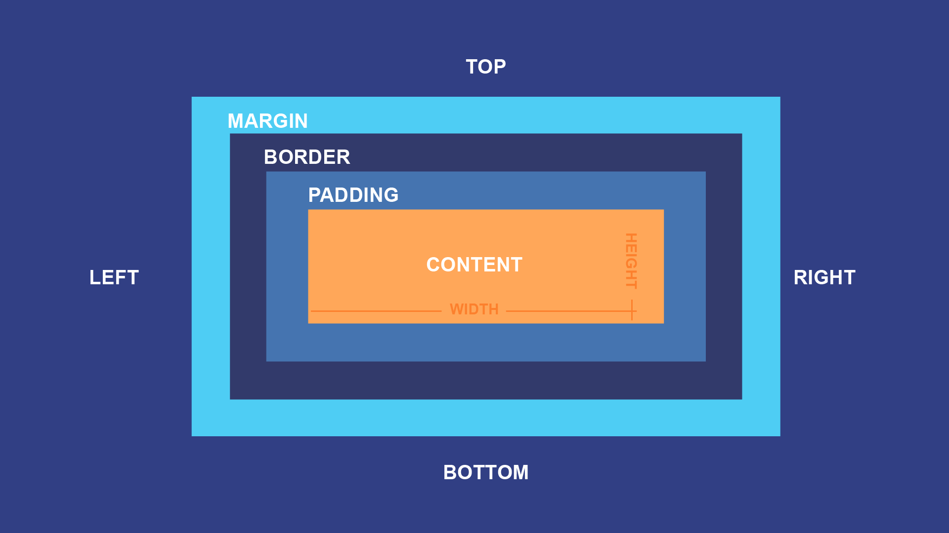
CSS Box Model:
The CSS box model is a fundamental concept that defines how elements are rendered on a web page. It consists of four parts: content, padding, border, and margin. Understanding the box model is crucial for controlling the dimensions and spacing of elements in your layout.
1. Content: The content area is where the actual content of the element, such as text, images, or other media, is displayed. The width and height of an element are determined by the size of its content.
2. Padding: Padding is the space between the content and the element's border. It provides a buffer area around the content, creating separation between the content and any borders or other elements nearby. Padding is transparent and doesn't have a background color.
3. Border: The border is a line that surrounds the padding and content areas. It is used to create a visual boundary for the element. You can define the border's width, style, and color using CSS properties.
4. Margin: Margin is the space outside the element's border. It creates a gap between the element and other nearby elements or the edges of the containing parent element. Margin is transparent and doesn't have a background color.
Illustration of the CSS Box Model:
Controlling Element Dimensions and Spacing Using the Box Model:
You can control the dimensions and spacing of elements using CSS properties related to the box model. Here are some commonly used properties:
1. Width and Height:
width: Sets the width of the content area.height: Sets the height of the content area.
2. Padding:
padding-top,padding-right,padding-bottom,padding-left: Sets the padding on individual sides.padding: Sets padding on all sides simultaneously (in a clockwise order: top, right, bottom, left).
3. Border:
border-width: Sets the width of the border on all sides.border-style: Sets the style of the border (e.g., solid, dashed, dotted).border-color: Sets the color of the border.
4. Margin:
margin-top,margin-right,margin-bottom,margin-left: Sets the margin on individual sides.margin: Sets margin on all sides simultaneously (in a clockwise order: top, right, bottom, left).
Example:
css/* Box model properties for a div element */
div {
width: 300px;
height: 200px;
padding: 20px;
border: 2px solid #333;
margin: 10px;
}
In this example, the div element will have a content area of 300px width and 200px height. It will have 20px padding around the content, a 2px solid border, and a 10px margin around the entire element.
CSS Layout:
CSS layout techniques are essential for structuring and positioning elements on a web page. They allow you to control the arrangement of elements, create responsive designs, and achieve various layouts. In this section, we'll introduce three fundamental CSS layout techniques: float, position, and display. Additionally, we'll explore how Flexbox and Grid offer powerful tools for creating responsive layouts.
- 1. Float:
The
floatproperty allows you to float an element to the left or right of its containing parent element. It is commonly used for creating multi-column layouts. Floated elements are taken out of the normal flow of the document, and other content will wrap around them.
Example:
css.column {
float: left;
width: 33%;
}
- 2. Position:
The
positionproperty enables you to control the positioning of elements. There are four positioning values:static(default): Elements follow the normal document flow.relative: Elements are positioned relative to their normal position.absolute: Elements are positioned relative to their closest positioned ancestor (or the viewport if there is none).fixed: Elements are positioned relative to the viewport and will remain fixed even when scrolling.
Example:
css.header {
position: fixed;
top: 0;
left: 0;
width: 100%;
background-color: #333;
color: #fff;
}
- 3. Display:
The
displayproperty determines the display behavior of elements. It can change elements from block-level to inline, or to other display types, allowing for more flexible layouts.
Example:
css/* Make all paragraphs display as inline */
p {
display: inline;
}
- 4. Flexbox: Flexbox is a powerful layout model that provides a simple way to distribute space and align elements within a container. It allows you to create flexible and responsive layouts with ease. The parent container becomes a flex container, and its children (flex items) are flex items that can be laid out in either a row or a column.
Example:
css.container {
display: flex;
justify-content: space-between;
}
- 5. Grid: CSS Grid Layout is a two-dimensional layout system that enables you to create complex grid-based layouts. It allows you to define rows and columns for the container and easily place elements into specific grid cells.
Example:
css.container {
display: grid;
grid-template-columns: 1fr 2fr 1fr;
grid-template-rows: 100px 200px;
}
Creating Responsive Layouts with Flexbox and Grid:
Flexbox and Grid are especially useful for creating responsive layouts. By setting appropriate flexbox or grid properties, you can make elements adjust automatically based on screen size and available space.
For example, using Flexbox's flex-wrap property, you can make flex items wrap to a new row when there's not enough space horizontally:
css.container {
display: flex;
flex-wrap: wrap;
}
Similarly, Grid's grid-template-columns property can be used with media queries to create a responsive grid layout:
css.container {
display: grid;
grid-template-columns: repeat(auto-fit, minmax(200px, 1fr));
}
CSS layout techniques like float, position, and display allow you to control element positioning and achieve various layouts. Flexbox and Grid provide powerful tools for creating responsive and flexible layouts, making it easier to adapt your designs to different screen sizes and devices. With a combination of these techniques, you can build aesthetically pleasing and responsive web layouts that enhance the user experience across different devices.
CSS Typography :
CSS Typography plays a crucial role in web design, as it enables developers to control the appearance of text on web pages. By manipulating font styles, sizes, weights, and families, designers can create visually appealing and readable content. Additionally, web-safe fonts and Google Fonts provide a vast selection of typefaces to enhance the typography of web pages. In this guide, we'll explore how to control typography using CSS and leverage web-safe fonts and Google Fonts for a more diverse and captivating text display.
- 1. Controlling Font Styles, Sizes, Weights, and Families:
a. Font Family: CSS allows you to specify the font family for your text. The font family represents the typeface you want to use for your content. It's a good practice to provide a fallback font in case the preferred font is not available on the user's device. For example:
cssbody {
font-family: "Helvetica Neue", Arial, sans-serif;
}
b. Font Size:
You can control the size of your text using the font-size property. It can be set in various units like pixels (px), ems (em), or percentages (%). For instance:
cssh1 {
font-size: 32px;
}
p {
font-size: 1.2em;
}
c. Font Weight:
The font-weight property determines the thickness or boldness of the text. It can be set to values like normal, bold, lighter, or specific numerical values like 400, 700, etc.
cssh2 {
font-weight: bold;
}
p {
font-weight: 400;
}
d. Font Style:
The font-style property lets you define whether the text should be italic, normal, or oblique.
cssem {
font-style: italic;
}
span {
font-style: normal;
}
- 2. Working with Web-Safe Fonts and Google Fonts:
a. Web-Safe Fonts: Web-safe fonts are fonts that are commonly found on most devices, ensuring consistent text display across different platforms. Examples of web-safe fonts include Arial, Helvetica, Times New Roman, and Verdana. Since these fonts are widely available, you can use them without any additional setup.
cssbody {
font-family: Arial, sans-serif;
}
b. Google Fonts: Google Fonts is a collection of free, open-source fonts that can be easily integrated into web projects. To use Google Fonts, you need to include the font link in the head section of your HTML document:
html<head>
<link href="https://fonts.googleapis.com/css2?family=Roboto:wght@400;700&display=swap" rel="stylesheet">
</head>
Once the link is added, you can apply the Google Font to your CSS:
cssbody {
font-family: 'Roboto', sans-serif;
}
By leveraging Google Fonts, you can enhance the typography of your web pages with a wide variety of typefaces.
CSS Typography is a powerful tool that allows web developers to control the appearance of text on their web pages. By manipulating font styles, sizes, weights, and families, designers can create visually appealing and readable content. Additionally, web-safe fonts ensure consistent text display across devices, while Google Fonts offer a vast collection of typefaces to add variety and creativity to your web designs. By mastering CSS Typography and exploring different font options, you can elevate the visual appeal and readability of your web pages, providing an enhanced user experience for your visitors.
CSS Transitions and Animations:
CSS Transitions and Animations are powerful tools that can add interactivity and visual appeal to your web pages. Transitions allow smooth changes to an element's style, while animations enable more complex and dynamic effects. In this tutorial, we'll explore how to use CSS Transitions and Animations to create smooth hover effects and simple animations.
- 1. CSS Transitions for Smooth Hover Effects:
CSS Transitions allow you to smoothly change an element's style when a specific property changes. A common use case is creating smooth hover effects. Let's see how to achieve this:
Step 1: Define the Base Styles: Start by setting the initial styles for your element:
css.button {
background-color: #3498db;
color: #fff;
padding: 10px 20px;
border-radius: 5px;
transition: background-color 0.3s ease;
}
Step 2: Add Transition Property:
In the base styles, we added the transition property to specify which property we want to animate (background-color) and the duration of the transition (0.3s). The ease timing function creates a smooth acceleration and deceleration effect.
Step 3: Add Hover Effect: Now, let's add a hover effect to change the background color when the user hovers over the button:
css.button:hover {
background-color: #ff6b6b;
}
With this setup, when the user hovers over the button, the background color will smoothly transition from the base color (#3498db) to the hover color (#ff6b6b).
- 2. CSS Animations using Keyframes:
CSS keyframes allow you to create more complex animations by defining a series of style changes at specific points in time. Let's create a simple animation that moves an element from left to right continuously:
Step 1: Define the Base Styles: Start with the initial styles for your element:
css.box {
width: 50px;
height: 50px;
background-color: #f39c12;
position: relative;
animation: moveRight 2s linear infinite;
}
Step 2: Define Keyframes: Define the keyframes that define the animation. In this case, we want the element to move from left to right across the screen:
css@keyframes moveRight {
0% {
left: 0;
}
100% {
left: 200px;
}
}
In the @keyframes rule, we specify the animation name (moveRight), and the percentage-based keyframes define the style changes over time.
Step 3: Apply the Animation:
In the base styles, we added the animation property, which specifies the animation name (moveRight), duration (2s), timing function (linear), and infinite to make it repeat continuously.
With this setup, the box will continuously move from the left edge to 200 pixels to the right, creating a smooth animation.
CSS Transitions and Animations are powerful tools to add interactivity and visual appeal to your web pages. By using transitions, you can create smooth hover effects to enhance user experience. CSS keyframes enable you to craft simple animations by defining style changes over time. By mastering these techniques, you can bring your web pages to life with engaging and captivating visual effects. Experiment with different properties, durations, and timing functions to create unique and dynamic animations that delight your users.
CSS Media Queries:
CSS Media Queries are essential for creating responsive web pages that adapt to different screen sizes and devices. By using media queries, you can apply specific styles based on the user's device characteristics, such as screen width, height, orientation, and resolution. This ensures that your web pages look great and provide a seamless user experience across various devices. In this tutorial, we'll explore how to use CSS Media Queries to make web pages responsive and adapt styles for different screen sizes and devices.
- 1. Setting Up the Basic Styles:
Start by creating the base styles for your web page. For example:
cssbody {
font-family: Arial, sans-serif;
line-height: 1.6;
margin: 0;
padding: 0;
}
.container {
width: 100%;
max-width: 1200px;
margin: 0 auto;
padding: 20px;
}
.header {
background-color: #3498db;
color: #fff;
padding: 20px;
}
.navbar {
background-color: #333;
color: #fff;
padding: 10px;
}
.content {
padding: 20px;
}
.footer {
background-color: #333;
color: #fff;
padding: 10px;
}
In this example, we have a basic layout with a header, navigation bar, content section, and footer.
- 2. Adding Media Queries:
Now, let's create media queries to adapt the styles for different screen sizes and devices.
css/* Small devices (phones) */
@media (max-width: 576px) {
.header, .navbar, .footer {
padding: 10px;
}
.content {
padding: 10px;
}
}
/* Medium devices (tablets) */
@media (min-width: 577px) and (max-width: 992px) {
.header, .navbar, .footer {
padding: 15px;
}
.content {
padding: 15px;
}
}
/* Large devices (desktops) */
@media (min-width: 993px) {
.header, .navbar, .footer {
padding: 20px;
}
.content {
padding: 20px;
}
}
In this example, we've used three media queries to target different screen sizes:
For small devices (phones) with a maximum width of 576 pixels, we reduce the padding for header, navbar, and footer, and content to make better use of the smaller screen space.
For medium devices (tablets) with a width between 577 pixels and 992 pixels, we use slightly larger padding to optimize the layout for tablet-sized screens.
For large devices (desktops) with a minimum width of 993 pixels, we use the original padding to provide a spacious and comfortable layout for larger screens.
These media queries ensure that the web page adapts its styles according to the user's device, creating a responsive and user-friendly experience across various screen sizes.
CSS Media Queries are essential for making web pages responsive and ensuring they look great on different devices. By using media queries to adjust styles based on screen sizes, you can create a seamless user experience across mobile phones, tablets, and desktops. Experiment with different media query breakpoints and styles to optimize your web pages for various devices, ensuring that your content remains accessible and visually appealing regardless of the screen size.
CSS Best Practices and Tips:
1. Writing Clean and Maintainable CSS Code:
- Use meaningful class and ID names: Choose descriptive names that reflect the purpose of the element or component. Avoid using generic names like "box" or "content" that could lead to conflicts or confusion.
- Avoid excessive use of IDs: IDs should be unique on a page, but using them for styling can lead to specificity issues. Prefer classes for styling and reserve IDs for JavaScript hooks or anchor links.
- Group related styles: Organize styles into logical blocks based on their purpose, making it easier to read and maintain the code.
- Comment your code: Add comments to explain complex styles, sections, or hacks. This helps other developers (and your future self) understand the code's intent.
- Consistent formatting: Maintain a consistent indentation and spacing to improve code readability and collaboration.
- Use shorthand properties: Utilize shorthand properties like
margin,padding, andborderto keep the code concise and reduce redundancy.
2. Organizing CSS with the Use of Classes and IDs:
- Follow the BEM (Block, Element, Modifier) methodology: BEM promotes a modular approach to CSS organization, making it easier to understand the relationships between different components.
- Use utility classes: Create small utility classes for common styles (e.g.,
.text-center,.hidden, etc.) that can be reused across the project. - Keep specificity in check: Avoid overly specific selectors that could lead to unintended side effects or difficulties in overriding styles.
3. Performance Optimization Techniques:
- Minimize the use of CSS frameworks: While CSS frameworks can speed up development, they often include many unused styles, leading to larger file sizes. Consider using only the necessary components or opting for smaller, specialized libraries.
- Use CSS minification: Minify your CSS files before deploying them to production to reduce their size and improve page load times.
- Limit the use of @import: Avoid using
@importstatements in CSS, as they can create additional HTTP requests and slow down page loading. - Use media queries effectively: Use media queries to load styles based on the user's device or screen size. This prevents loading unnecessary styles on devices where they aren't required.
- Optimize image usage: Use appropriate image formats and compress images to reduce their file size without compromising quality.
By following these best practices and tips, you can write clean, organized, and performant CSS code that is easier to maintain and enhances the overall user experience on your web pages.
Introduction to CSS Preprocessors (Sass and Less):
CSS preprocessors are scripting languages that extend the capabilities of standard CSS. They provide additional features like variables, mixins, nesting, and more, making CSS authoring more efficient and maintainable. Two popular CSS preprocessors are Sass (Syntactically Awesome Style Sheets) and Less. In this section, we'll introduce these preprocessors and explore their key features.

- 1. Sass (Syntactically Awesome Style Sheets):
.scss extension, and they are compiled into standard CSS before deployment.Key Features of Sass:
- Variables: Sass allows you to define variables to store values such as colors, font sizes, and margins. This makes it easy to reuse values throughout the stylesheet and maintain consistency.
- Nesting: With Sass, you can nest CSS rules within one another, following the HTML structure. This helps create a more organized and intuitive stylesheet.
- Mixins: Mixins allow you to define reusable sets of styles that can be included in multiple CSS rules. They work like functions, making it easier to apply complex styles without duplication.
- Partials and Imports: Sass supports partials, which are smaller
.scssfiles that can be imported into the main stylesheet. This helps in breaking down the codebase into manageable pieces.
- 2. Less:
Less is another popular CSS preprocessor that shares many similarities with Sass. Less files have a .less extension and are compiled into standard CSS.
Key Features of Less:
- Variables: Similar to Sass, Less allows the use of variables to store values and promote code reuse.
- Nesting: Less provides nesting capabilities, making the CSS structure more intuitive and organized.
- Mixins: Less also supports mixins, enabling developers to create reusable sets of styles.
- Imports: Less allows you to import other
.lessfiles, making it easier to structure the codebase.
How to Use Variables, Mixins, and Nesting for Efficient CSS Authoring:
- 1. Variables:
scss// Sass
$primary-color: #3498db;
// Less
@primary-color: #3498db;
- 2. Nesting:
scss// Sass
.navbar {
background-color: $primary-color;
color: #fff;
padding: 10px;
a {
color: #fff;
text-decoration: none;
&:hover {
text-decoration: underline;
}
}
}
// Less
.navbar {
background-color: @primary-color;
color: #fff;
padding: 10px;
a {
color: #fff;
text-decoration: none;
&:hover {
text-decoration: underline;
}
}
}
- 3. Mixins:
scss// Sass
@mixin center-element {
display: flex;
justify-content: center;
align-items: center;
}
// Less
.center-element {
display: flex;
justify-content: center;
align-items: center;
}
CSS preprocessors like Sass and Less offer valuable enhancements to standard CSS, improving code maintainability, reusability, and organization. By utilizing variables, mixins, and nesting, developers can write more efficient and scalable stylesheets, reducing code duplication and making CSS authoring a more enjoyable and productive experience. While CSS preprocessors are optional, they are widely adopted in modern web development due to the numerous benefits they provide.
Overview of Popular CSS Frameworks (Bootstrap and Foundation):
CSS frameworks are pre-designed sets of CSS files that provide a collection of ready-to-use styles and components for web development. They help streamline the development process by providing a solid foundation and consistent design across projects. Two of the most popular CSS frameworks are Bootstrap and Foundation.
- 1. Bootstrap:
Bootstrap, developed by Twitter, is a widely used CSS framework that offers a comprehensive set of CSS and JavaScript components for building responsive, mobile-first websites and web applications. It is known for its ease of use, flexibility, and large community support.
Key Features of Bootstrap:
- Responsive Grid System: Bootstrap provides a powerful grid system that allows developers to create responsive layouts for different screen sizes.
- Pre-styled Components: Bootstrap comes with a plethora of pre-built components like buttons, forms, navigation bars, modals, carousels, and more, making it easy to create consistent UI elements.
- Mobile-First Approach: Bootstrap follows a mobile-first approach, ensuring that websites look great and function smoothly on various devices.
- Extensive Documentation and Community: Bootstrap offers detailed documentation and a vast community of users and contributors, providing resources and solutions for common issues.
- 2. Foundation:
Foundation, developed by ZURB, is another popular CSS framework that focuses on responsive web design and rapid prototyping. It provides a range of customizable components and layout options.
Key Features of Foundation:
- Responsive Grid System: Foundation offers a responsive grid system that allows developers to create flexible layouts for different devices.
- Modular Components: Foundation's modular approach enables developers to pick and choose the components they need for their project.
- Accessibility: Foundation emphasizes accessibility, ensuring that websites built with the framework are usable by people with disabilities.
- Customizable and Theming: Foundation allows developers to customize and theme the framework according to the project's requirements.
How to Use Pre-built CSS Components to Speed up Development:
Using pre-built CSS components from frameworks like Bootstrap and Foundation can significantly speed up development and ensure consistent and visually appealing designs. Here's how to get started:
- 1. Include the Framework: Download the framework files or include them via a content delivery network (CDN) in your HTML document's head section:
html<!-- Bootstrap -->
<link href="https://cdn.jsdelivr.net/npm/bootstrap@5.3.0/dist/css/bootstrap.min.css" rel="stylesheet">
<!-- Foundation -->
<link href="https://cdn.jsdelivr.net/npm/foundation-sites@6.6.3/dist/css/foundation.min.css" rel="stylesheet">
- 2. Use Pre-built Components: Refer to the framework documentation to explore the available components and styles. For example, to use a Bootstrap button, add the appropriate class to your HTML element:
html<!-- Bootstrap Button -->
<button class="btn btn-primary">Click Me</button>
Similarly, Foundation provides pre-styled components that can be easily incorporated into your project:
html<!-- Foundation Button -->
<button class="button">Click Me</button>
- 3. Customize as Needed: Frameworks like Bootstrap and Foundation offer customization options to tailor the components to your project's specific needs. Refer to the documentation for guidance on customizing colors, typography, and more.
CSS frameworks like Bootstrap and Foundation provide developers with a valuable set of pre-built CSS components and styles, accelerating the development process and ensuring consistency and responsiveness across projects. By leveraging these frameworks, developers can create modern, responsive, and visually appealing web applications and websites with less effort, ultimately saving time and resources. Whether you choose Bootstrap, Foundation, or any other CSS framework, using pre-built CSS components is a best practice to enhance efficiency and deliver high-quality user experiences.

